UI/UX Design Basics for Beginners: Essential Principles for Great UX

Building intuitive digital interfaces that balance visual elegance, user empathy, and frictionless accessibility.
Key Takeaways & Highlights
- UI (User Interface) is how the product looks and feels; UX (User Experience) is how effortlessly the user accomplishes their goal.
- Visual hierarchy guides human scanning paths using scale, weight, contrast, and whitespace.
- Design systems with consistent color tokens, typography scales, and component variants reduce cognitive load.
- Accessibility (WCAG 2.2 AA) is non-negotiable: 4.5:1 contrast ratios and keyboard navigability benefit all users.
Table of Contents
Great design is invisible. When an application works intuitively, users achieve their goals effortlessly without friction. In 2026, creating exceptional digital experiences requires uniting deep user empathy with clean visual craft.
1. What is the Difference Between UI and UX?
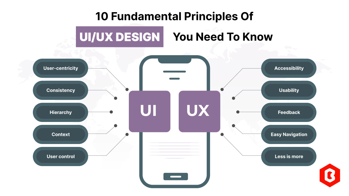
UX defines user journeys and architecture; UI brings emotional polish, typography, and micro-interactions.
UX Design encompasses user research, information architecture, customer journey mapping, and wireframe testing. UI Design is the visual expression: typography pairings, color harmonies, component states, and micro-animations.
2. The 5 Core Principles of Visual Hierarchy
- Scale & Size: The eye naturally gravitates toward larger elements first. Titles must visually dominate secondary subheadings.
- Contrast: High contrast draws attention to primary Call-to-Action (CTA) buttons.
- Whitespace (Negative Space): Generous breathing room declutters screens and establishes visual relationships.
- Proximity: Related UI elements should be grouped tightly together (Gestalt law of proximity).
- Alignment: Consistent grid grids prevent chaotic cognitive friction.
The Squint Test: Squint at your design mockup. If you cannot immediately identify the single primary action on the page, simplify the competing visual weights.
3. Design Systems & Token Architecture
Modern product teams avoid ad-hoc colors and pixel values. Instead, they define semantic Design Tokens in CSS variables:
:root {
  /* Semantic Brand Tokens */
  --color-primary: #6366f1;
  --color-success: #10b981;
  --color-danger: #ef4444;

  /* Typography Scale */
  --font-display: 'Space Grotesk', sans-serif;
  --font-text: 'Plus Jakarta Sans', sans-serif;

  /* Elevation & Radius */
  --radius-card: 16px;
  --shadow-elevation: 0 10px 30px rgba(0, 0, 0, 0.25);
}
4. Jakob Nielsen's Usability Heuristics Applied
"Recognition over recall: Minimize the user's memory load by making elements, actions, and options visible."
Ensure system status visibility (loading spinners, progress indicators), provide clear undo mechanisms, and prevent errors through defensive form validation.
5. Accessible Design (WCAG 2.2 Checklist)
| Principle | Requirement | Implementation |
|---|---|---|
| Contrast | Minimum 4.5:1 for body text | Use APCA / WebAIM contrast validators |
| Focus States | Visible keyboard focus ring | :focus-visible { outline: 2px solid var(--primary); } |
| Touch Targets | At least 44x44px target area | Generous padding around interactive buttons |
| Dark / Light | Frictionless theme switching | High readability in both ambient lighting conditions |