Mobile-First Web Design Guide: Build Responsive Websites Easily

- Over 62% of global web traffic originates from mobile devices. Mobile-first is the primary baseline.
- Write base CSS for small screens first, progressively enhancing layout with
min-widthmedia queries. - Implement fluid typography and spacing using CSS
clamp()to eliminate jumpy breakpoint snapping. - Ensure touch targets meet accessibility minimums: at least 44x44 CSS pixels with generous hit padding.
Mobile-first design is a strategic methodology where web applications are architected for small viewports first, then progressively layered with richer layouts and features as screen real estate expands. It forces design discipline and guarantees blazing performance on cellular networks.
1. Why Mobile-First Design Matters in 2026
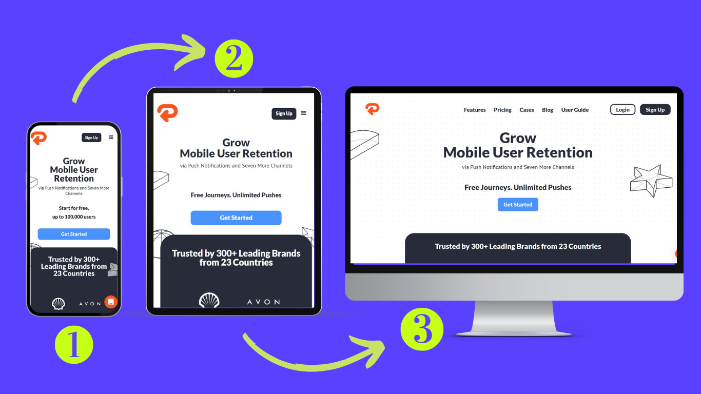
Starting with desktop layouts and attempting to squeeze them down into mobile screens frequently results in bloated CSS overrides, clipped modals, and sluggish performance. Designing mobile-first ensures the critical user journey is clean and distraction-free.
2. Progressive Enhancement with min-width Queries
Write your default CSS rules without media queries (targeting mobile devices directly). Then use min-width breakpoints to expand into columns on larger screens:
/* Mobile Baseline: 1 Column */
.feature-grid {
    display: flex;
    flex-direction: column;
    gap: 1.25rem;
}

/* Tablet (768px+) */
@media (min-width: 768px) {
    .feature-grid {
        display: grid;
        grid-template-columns: repeat(2, 1fr);
        gap: 1.75rem;
    }
}

/* Desktop (1024px+) */
@media (min-width: 1024px) {
    .feature-grid {
        grid-template-columns: repeat(3, 1fr);
        gap: 2rem;
    }
}
3. Fluid Typography & Spacing using clamp()
Modern CSS clamp(min, preferred, max) scales text size seamlessly between viewport widths without discrete stepping jumps:
h1.hero-title {
    /* Scales smoothly from 2.2rem at 360px up to 3.8rem on large desktops */
    font-size: clamp(2.2rem, 5vw + 1rem, 3.8rem);
    line-height: 1.15;
}
4. Touch Ergonomics & Thumb-Zone Mapping
min-height: 44px; min-width: 44px; on clickable buttons, hamburger icons, and form inputs to prevent frustrating mis-taps.
5. Mobile UX Audit Checklist
- Set viewport meta tag:
<meta name="viewport" content="width=device-width, initial-scale=1.0">. - Prevent horizontal scrolling overflow by ensuring no fixed pixel widths exceed 100vw.
- Use sticky bottom navigation bars for quick reachability on mobile devices.
- Test touch inputs on real hardware under both light and dark display modes.